Create
We were given the task to research a brand that could benefit from a rebranding. After researching that brand, the task was to create a strategy of a direction that the brand could benefit from. From there, we were tasked with translating the strategy into a powerful and memorable identity through mark, wordmark, and color pallet to have a well-intentioned design package, pushing the brand forward.
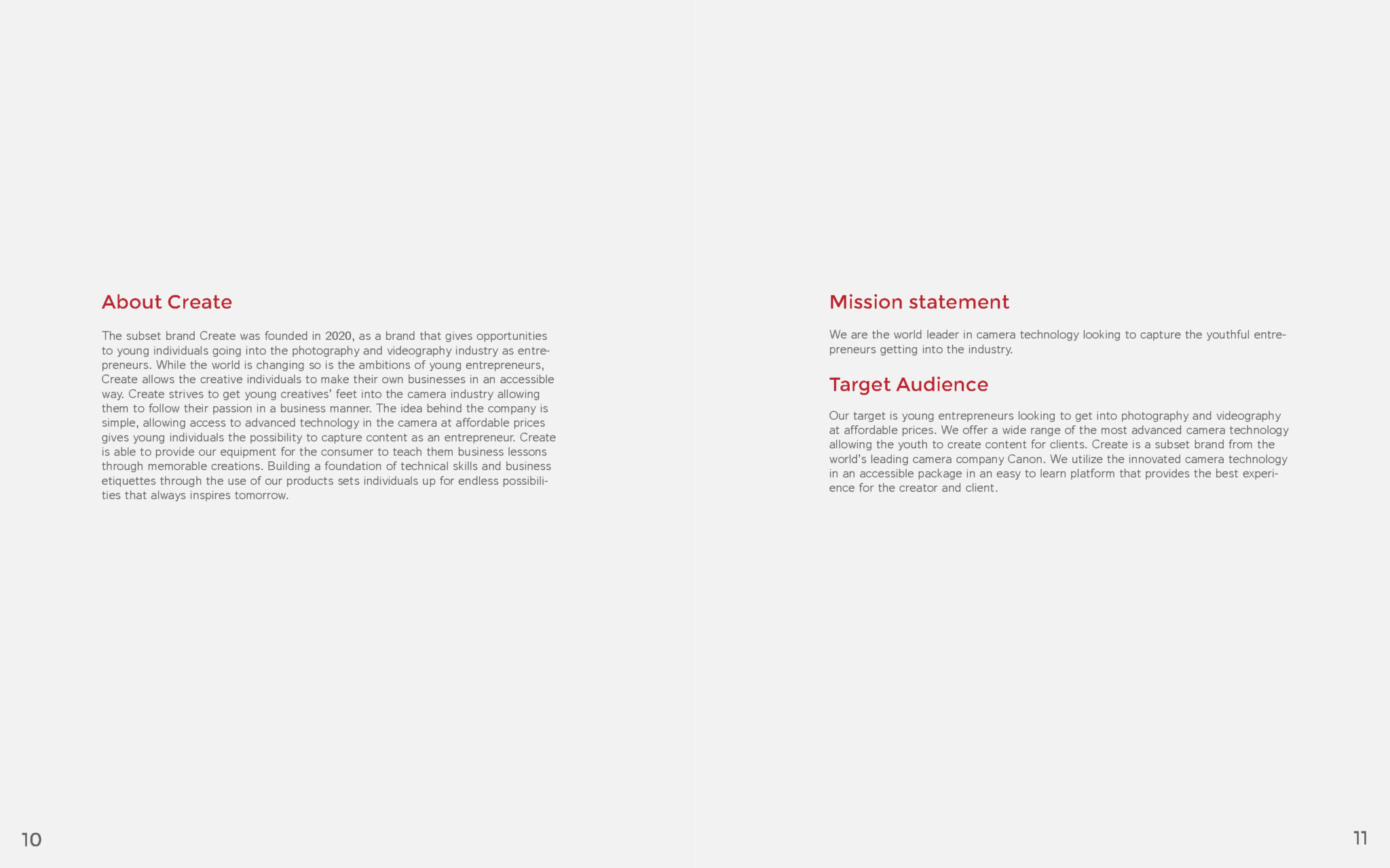
The rebrand of Canon was needed due to the outdated mark and opportunity to capitalize on young consumers. Creating a subset brand of Canon called “Create” appeals to the young entrepreneur that wants to get into photo/video for a secondary income. Reworking the original Canon wordmark to give it a modern look capitalizes on the simple trend to connect to the subset “Create” brand.
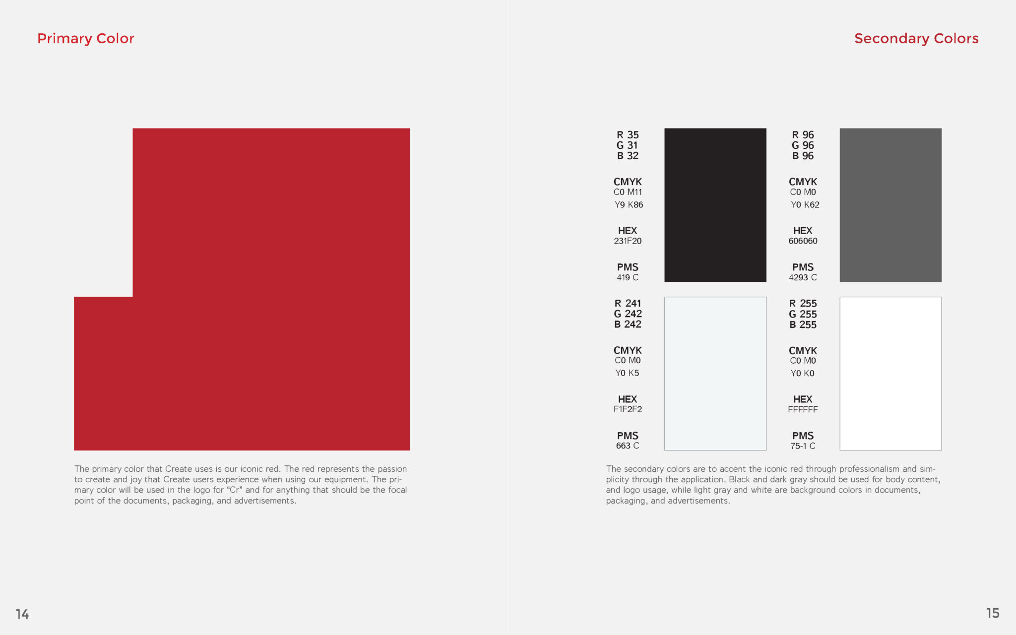
The subset brand, “Create,” of Canon is in a san serif font to bring the brand into more appealing trends for the younger audience. Keeping the classic Canon “C” allows it to carry equity from the original Canon brand to the subset brand of “Create.” The use of “Cr” is a word that played off the raw format that Canon formats their images (CR-2) post capture in the camera. The color further opened the ability to capitalize on the Cr in the iconic red that maintains inspiration from the flagship brand Canon. The rest of the lowercase letters follow the slight angles off the letterforms from the Canon mark. Overall, the new “Create” subset follows direction from the original mark while capitalizing on a new consumer market.


